Every company needs to have a strong brand. It is an essential piece of a marketing strategy, but for GroupOne Health Source and Pradot, it's much more. We have been busy over the past couple of months developing our new brand and launching our new website, and now we're taking you behind the scenes to understand why our new brand is more than just a piece of our marketing strategy.
Why a Rebrand?
This past month, we launched an entirely new website and introduced our new brand identity at our first ever TEAM employee retreat in St. Louis, Missouri.
We’ve spent nearly 28 years as GroupOne Health Source and decided it’s time our outside appearance more closely matched who we are on the inside. As we head into 2020, we couldn’t be more excited about a new era for GroupOne Health Source and Pradot, and here's why.
The Road to Rebranding
While GroupOne Health Source began in 1991, Pradot Technologies Limited and GroupOne Health Source have worked together as entities since 2007. But as we looked ahead to 2020, we decided it was time for both GroupOne and Pradot to rebrand to more accurately represent our shared mission of simplifying the business of medicine.
GroupOne and Pradot have long worked together to provide medical billing, transcription, and back-office solutions for healthcare providers. In 2007 GroupOne and Pradot joined forces to scale quickly to meet the needs of clients and help healthcare leaders enhance RCM performance. Since then, we have operated under two names and two different brand identities, which created unnecessary challenges over time.
With recent changes in corporate structure, accountability, and our service model, we have brought about a more connected global workforce with a new mission, a new vision, and a new purpose. We aren’t the company we were over ten years ago and knew it was time for our brands to come together to represent the changes that have taken place.
We began by asking our employees and customers to help us understand our brands. In the process, we found a lot of confusion and, frankly, a lot of room for improvement. We turned to our friends at Media Junction for some serious guidance. We needed a new brand and a new website, but we weren’t sure where to start. We dove even deeper into our brand, who we are, what we do, and why we do it.
We asked ourselves, who are we?
We needed a way to more clearly communicate who we are collectively at Pradot and GroupOne Health Source so with extensive research and the help of Media Junction’s team; we came up with our key brand attributes that we feel describe us best:
- Trustworthy
- Transformative
- Approachable
- Innovative
- Professional
- Reliable
- Exciting
- Fun
- Fresh
With all of this research into who we are and why it was time to build our Story Brand.
Building a New Brand
Remember early on when we mentioned the brand and how we surveyed our employees and our clients? The results were all over the place. That was a huge problem, and here’s why.
Mixed messages cause confusion.
Before we ventured down the path to rebranding, a few of our team members came across a book by Donald Miller called Building a StoryBrand. In the book, Miller describes a simple framework that not only clarifies your message for your customers, but it also aligns your employees and your customers behind the same message (or the same story).
It seemed too easy, and, as it turned out, writing our story was one of the most difficult phases of rebranding.
After several revisions and conversations, we pulled together all of the elements that make up Revele, why we exist, and the problems that we help our clients solve. The result? A story that perfectly articulates who we are, the problems we solve, and why we exist.
A New Logo
Revele isn’t just a new name. We aren’t the company we were 25 years ago, but we are all of those things and more, which is what makes Revele a thoughtful and unique representation of not only who we are but also where we are going. But as we decided on our new name and crafted our brand’s story, we needed something to visually represent this new era of GroupOne Health Source and Pradot.
We turned to Media Junction to help us create a logo that is not only modern and sleek but also thoughtful and equally as unique as our new name. To us, Revele is how we elevate the revenue for our clients. But it is also how we elevate one another as a company dedicated to working together as a team.
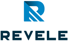
Our logo signifies 3 key concepts.
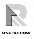
The first concept ties our previous logo to our new logo. The three lines that used to divide our GroupOne Health Source circle now represent Revele’s growth mindset for our clients and ourselves.

Second, we wanted to incorporate teamwork, one of our most crucial core values into our logo. We know that to go far, we must go together. In our logo, you can see the shape of a mountain, which reminds us of the teamwork required to reach new heights.
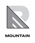
And third, if you look closely, you’ll see a 1. Moving forward as Revele, it’s vital that we not forget that we are still one group, just not GroupOne.
Developing Our Color Palette
Now that we had a new logo, we needed to iron out the rest of our visual identity - colors, fonts, patterns, imagery.
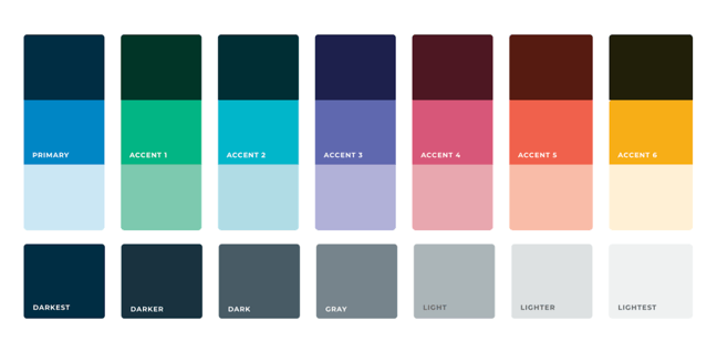
We want Revele to feel bold but balanced.
- Bold is daring. We see bold as being strong but also being bright. We wanted our colors to be courageous and eye-catching while also remaining balanced.
- Balanced feels positive and healthy. Our colors not only catch your eye but demonstrate prosperity, progress, and vitality.
Introducing Revele
The past few months have been long, but we are excited for our future as Revele.
We hope you ![]() it as much as we do.
it as much as we do.


